JUST BECAUSE
WE CARED.
TLDR: Mande's product felt inconsistent because design changes in Figma weren't translating effectively to engineering, causing different parts of the platform to drift apart visually. Working as a team of three, we ran a full audit, then rebuilt the entire design foundation from scratch: color system, typography, icons, spacing, and components, and shipped it as a unified Figma library that now serves as the single source of truth across Mande's products.
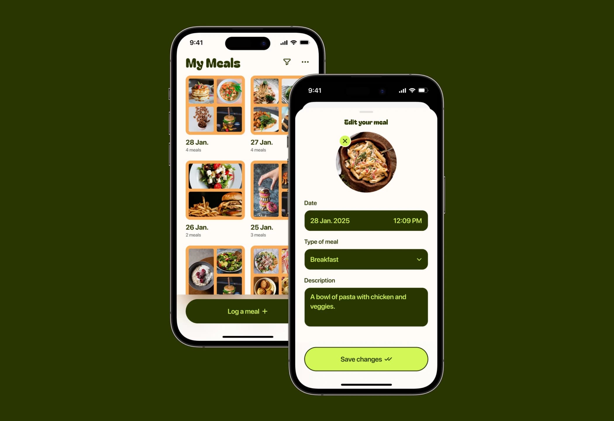
Mande is a career discovery platform helping students find jobs, grow professionally, and navigate their careers. The decision to rebuild the design system didn't start with a brief or a stakeholder request. It started with a feeling. When we were designing in Figma, what we were producing didn't feel the same as what was being shipped to production. Things felt slightly off, but we couldn't point to exactly why.
So we ran an audit. We took screenshots from across the platform, dumped them together, and looked at everything side by side. That's when it became obvious. Different fonts appearing across the same product. Hex codes that were close but not quite the same.
Hex codes that were close but not quite the same. Inconsistent spacing, inconsistent border radius, components that had drifted from their original intent. Parts of the product were being built on an evolving Figma foundation, but the changes weren't translating effectively to engineering.
New features reflected the updated direction while older ones still carried the original foundation. The product felt like two different things joined together.
Once we saw it clearly, we knew what we had to do. We took a step back and rebuilt everything from the ground up.
The team was three people: myself, Emmanuel, and Eugene, the front-end engineer. My role focused closely on the color system and the type system, working in tight collaboration with the Emmanuel throughout.
We started with typography. Mande had previously used Figma Tree, then switched to Inter before the design system work began. Midway through, we seriously considered Geist by Vercel, but when we implemented it and sat with it, it didn't give us the feeling we were going for. Inter did. It felt timeless, it fit Mande's voice, and it held up across every context we tested it in.
It felt timeless, it fit Mande's voice, and it held up across every context we tested it in. So we committed to Inter and built the type scale around it, updating line heights from 22px to 24px to give multi-line text enough room to breathe, and shifting headings from bold to semi-bold where bold felt too heavy for the interface.
For color, we rebuilt the entire system. We derived a gray scale from Mande's brand green, using black and white overlays to manipulate tones across light and dark mode. The light mode grays, when flipped, largely worked for dark mode too, giving the system a coherence that felt intentional rather than forced.
We introduced 60 shades across the palette to create meaningful separation between colors used in different contexts, ran accessibility contrast checks throughout, and created a dedicated text style system for colored backgrounds so legibility held up regardless of what was behind the text.
We also evaluated and updated the decorative color palette to harmonize with the new gray system, simplifying the shade range and giving each color a clear role: text, main, and partner.
I broke down the full color process on YouTube — watch how we built the palette from scratch.
For icons, we moved from Phosphor Icons to Mingcute, which aligned better with the visual direction we were establishing. Components and spacing were rebuilt from scratch using the new foundation principles, border radius system, and color tokens, and shipped as a combined foundation and component library in Figma.
The workflow that came out of this was just as important as the system itself. Designs are now built off the new design system. Eugene builds the templates in code and hands them off to the front-end engineer working on a given feature, who then works with the back-end team to integrate and ship. The foundation is no longer a moving target. The product finally feels like one thing.